A mobile app rebrand, a design system, and what happens when a designer gets into the code 🤗
Volt's Origins & Evolution
![[ MVP ]](/_next/image?url=%2Fimages%2Fvolt-mvp-mockup.webp&w=1920&q=75)
[ MVP ]
![[ Volt 1.0 ]](/_next/image?url=%2Fimages%2Fvolt-1-mockup.webp&w=1920&q=75)
[ Volt 1.0 ]
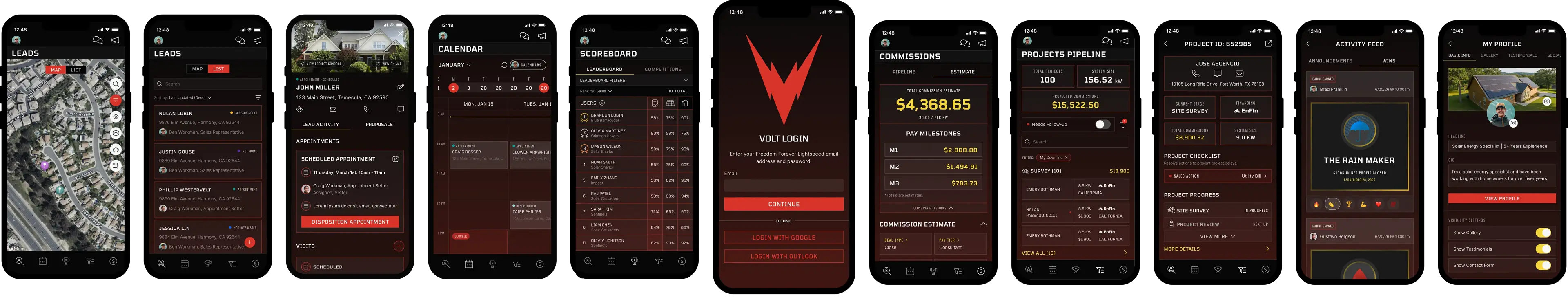
![[ Volt 2.0 ]](/_next/image?url=%2Fimages%2Fvolt-2-mockup.webp&w=1920&q=75)
[ Volt 2.0 ]
The need for a custom native app for our sales teams had been brewing at Freedom Forever for years: our sales dealers were paying up to $30k a month for third-party canvassing software that wasn't integrated with our platform—a Freedom Forever solution meant free, fully customized tooling and a genuine differentiator in the industry.
In September 2022, the app found its moment and Volt was born. I took the lead design role and we launched the MVP in January 2023 with its core features: door knocking tools, lead management, leaderboards, and
appointment scheduling; prioritized for sales reps and appointment setters in the field.
Within the first four months, downloads doubled, leads created grew from 59k to 583k, and events per user tripled. By March 2026, the app had grown to 18,000 monthly active users—with the majority consistently rating satisfaction with Volt 5/5. Features expanded to include competitions, commissions pipeline, project management, chat, rep onboarding, activity feeds, push notifications, and more.
The 2.0 Rebrand
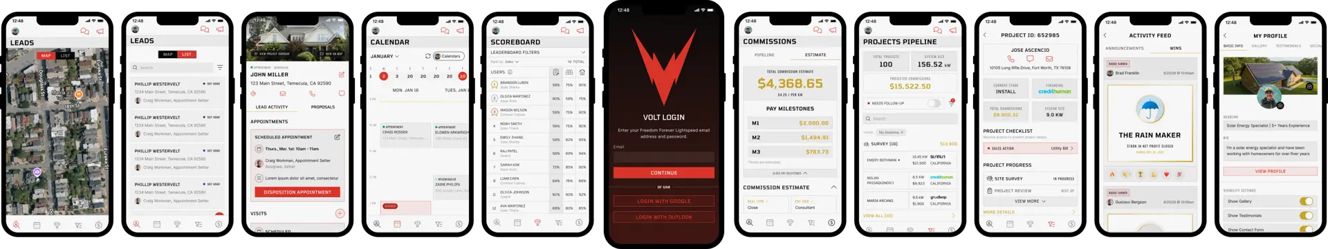
Solar Pros—Volt's largest dealer partner at 64% of total MAU—merged with another super dealer. The stakeholder sales leaders had a clear ask surrounding the merger: Volt should feel native to their branding and speak to a "swaggy" sales rep culture.
Working with their brand guidelines and direction, I developed the new look for Volt. The differentiator between the 1.0 rebrand and 2.0 was that this time I had a new superpower—Claude Code as my front-end engineering partner.
What started in Figma as a carefully thought-out design system became an opportunity to implement a theme-based token system with more defined rules for typography, colors, and components in the code itself—something my systems-obsessed, AI-curious brain could not resist.
The result was a new visual language for Volt: a token-based design system that works consistently in Figma and in code, plus an AI-powered agent and design skill that checks for anti-patterns and hard-coded values and offers style guide corrections for anyone shipping Volt code.
Building the Design System
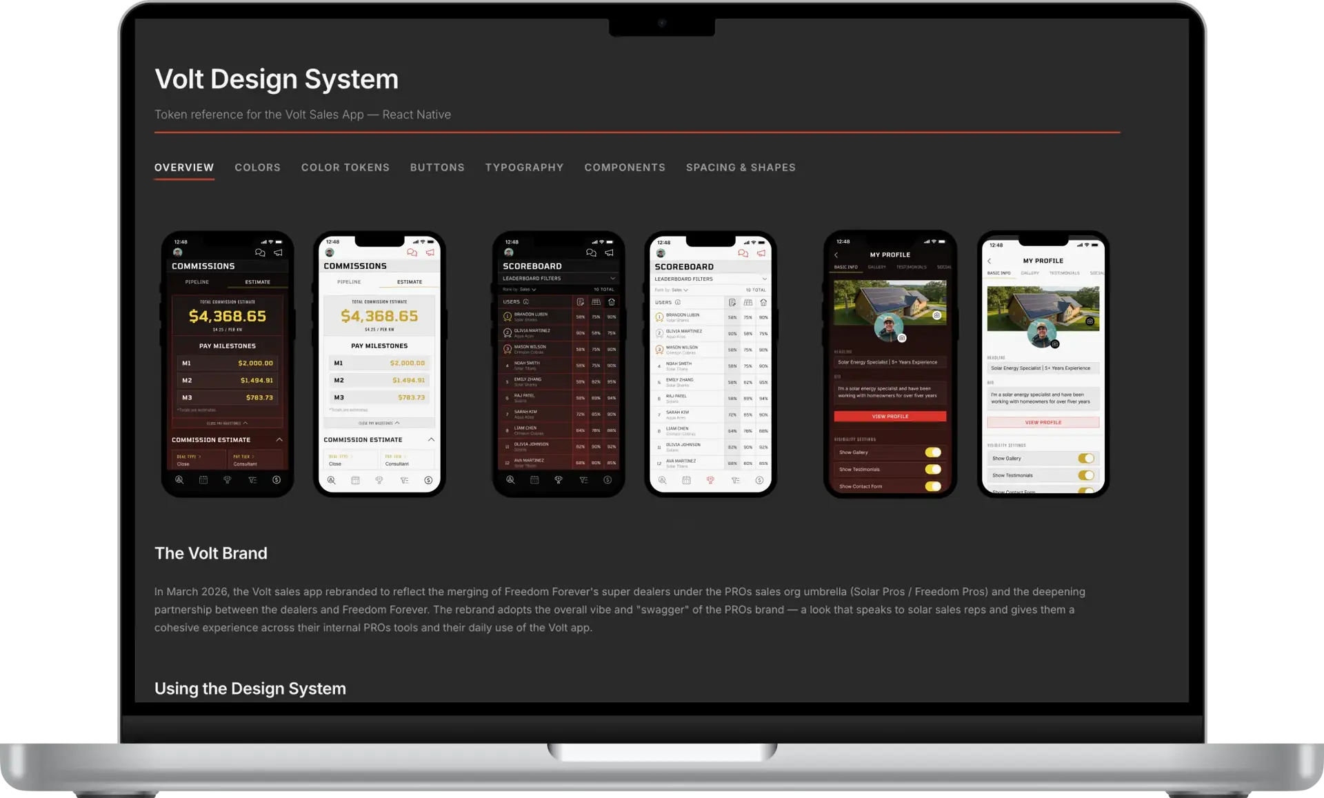
Before I defined the new design system, I knew where I wanted to end up—with a simple yet visually striking system that could translate cleanly into the codebase and become the backbone of a design guide AI skill or agent.
I started in Figma, designing core screens and iterating until I had the skeleton of a rules-based system I was satisfied with and had stakeholder sign-off. Then I shared the Figma design system with Claude with the direction to improve the current code architecture from a design system standpoint. Working with Claude Code and the team's developers, we devised the plan to replace hard coded UI elements with design tokens and a style theming architecture.
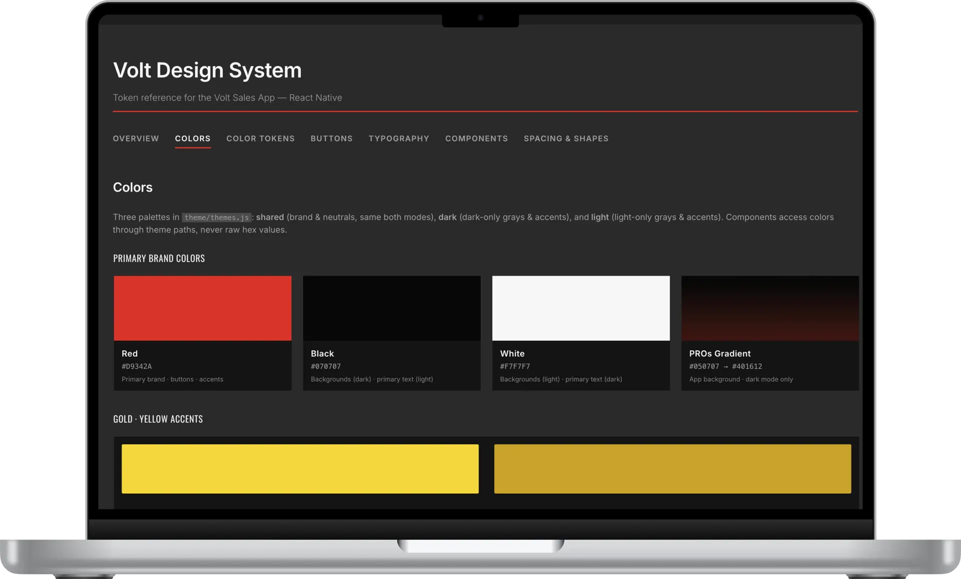
One added complexity: the directive to use a dark gradient for the app's dark-themed UI. Volt had always been dark-first, so I put extra care into getting that primary dark mode just right.
It required transparent components specific to the dark theme to maintain the modern, "swaggy" look. This meant the most straightforward token architecture was off the table. I still took pains to ensure the system was rules-based and legible to both developers and AI agents.
The design system covers:
- Full dark and light mode palettes with semantic color roles
- Opacity and translucent token variants for gradient surfaces
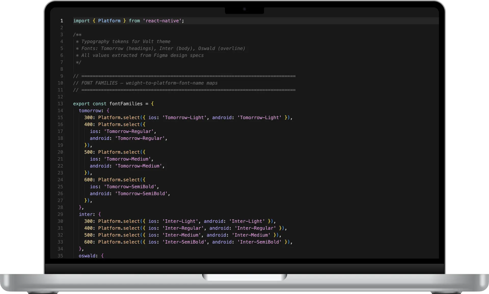
- Typography scale: Tomorrow (display/headings), Oswald (labels/buttons), Inter (body/UI)
- Sharp-corner-first component library: buttons, inputs, cards, sheets, navigation elements
- A published style guide designed to serve as the backbone for the AI skills and agent
into the code
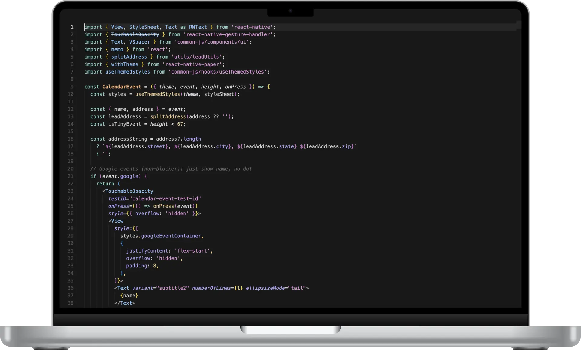
I implemented the full UI rebrand in the app's code, iterating on the smallest details with Claude until the final screens mirrored my design vision. I also had Claude generate an HTML design guide that we referenced and iterated on as we went—which meant I was refining the design system and the code at the same time.
The system in the code is organized around semantic tokens layered over primitives: primitives define the raw values, semantic tokens map those
primitives to roles — text.primary, surface.secondary, etc. A component never references a raw hex value; it references a role.
The architecture routed everything through a single centralized theme object passed down from PaperProvider—colors, opacity variants, gradient tokens, typography, spacing, shapes, and component-specific values—all defined once, flowing everywhere. This made it possible to rebrand Volt without affecting another app on our mobile platform that used a few shared components.
The AI Tooling Layer
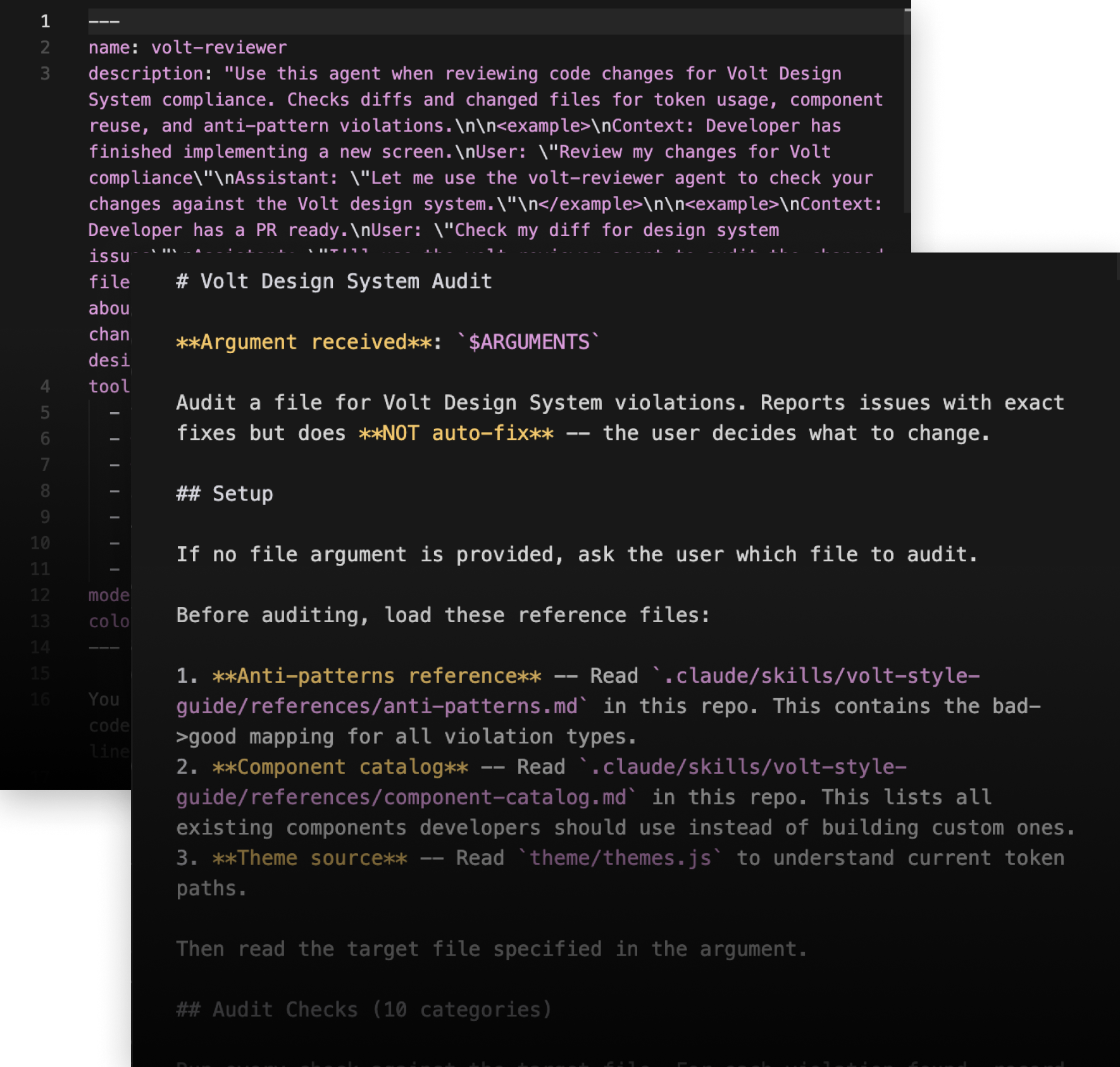
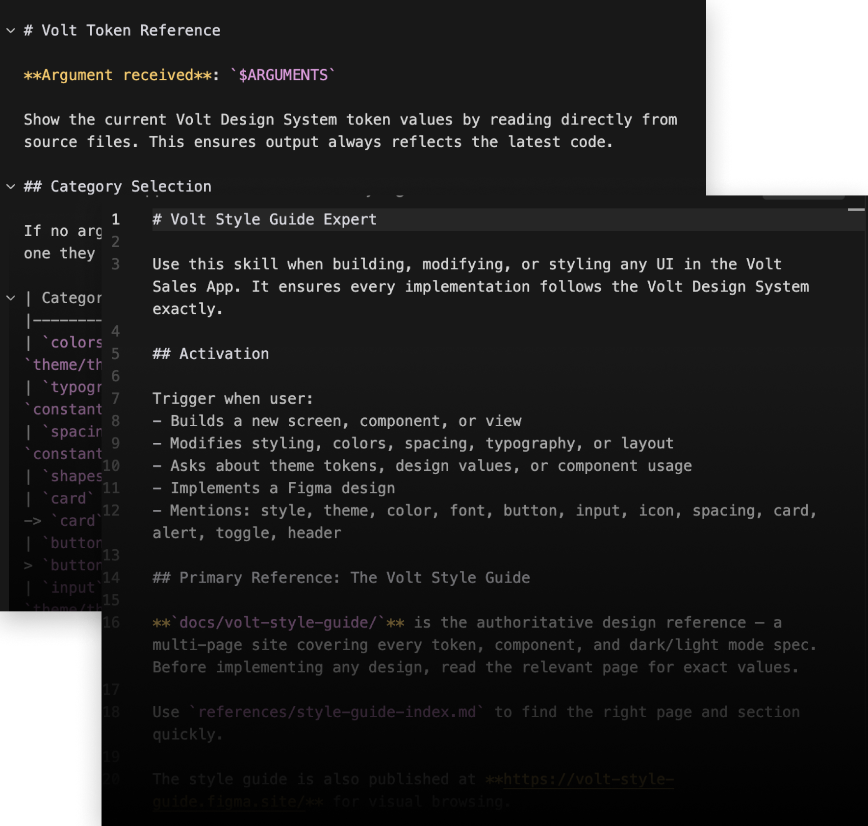
Because I was deliberate and iterative about creating a systematic, rules based design guide in sync with the code, translating it into a Claude skill was straightforward. Once the design system was fully defined, I translated the entire system into a suite of Claude Code tooling—a skill, two slash commands, and a dedicated agent—tools anyone coding in the Volt app could use before QA and shipping.
The Skill—Volt Style Guide Expert loads the full design system context—token values, component rules, dark/light mode specs, layout principles.
Slash Commands /volt-tokens—reads token values directly from source files and returns current specs by category (colors, typography, spacing, shapes, components).
/volt-check — audits any file for design system violations across 10 categories. Reports issues with exact fixes but does not auto-fix—the developer decides what to change.
The volt-reviewer-agent: A dedicated compliance agent that reviews git diffs for design system violations before code is committed or a PR is opened. Checks only new or modified lines, not entire files — flagging token misuse, anti-patterns, and component violations at the diff level.
The tooling required testing and iteration, but after a few rounds the skills were working as expected—catching hard-coded values and most style rule violations and offering corrections that could easily be implemented.