Rapid research and prototyping for an in-house LMS
The business case & Kick off

The business case for an in-house LMS was obvious: we were paying $20,000 a month for Docebo, a clunky third-party training platform that was prone to technical issues out of our control. It was also one of the first touch points reps had with our system during onboarding and was required before fully accessing Volt. Building an in-house LMS would have been time prohibitive just a handful of months prior, but with AI we could do it ourselves in a fraction of the time.
We kicked things off with a full team brainstorm to identify the core needs for the learning experience and admin tool. We covered requirements for version 1.0 and noted ideas to save for future enhancements as well as first step research tasks. Then the PM and developer started work on the back-end and LMS admin portal.
The Audit
I went through our full onboarding flow the way a rep would—hitting the required online training and going through the full set of lessons. As I went, I opened a Claude chat in Slack as a running notepad, recording my observations via voice transcription as they came to me.
I noted what I thought the platform got right—the lessons were bite-size less than 10 minutes each with some interactivity, layout and format variety, with questions or quizzes to confirm comprehension. And I noted the UX problems—the bite-sized lessons encouraged me to keep going but they didn't automatically lead to the next required lesson. Instead I lost momentum figuring out where I was and what was next. And overall the mobile experience was not clean and responsive.
Ideas surfaced mid-audit: what if instead of a standard quiz, certain lessons asked reps to record themselves explaining a concept in their own words? For technical content like net metering, true-ups, utility rate structures—the kind of knowledge you need in the field—being able to articulate it out loud is a better test of understanding than picking an answer from a list. Or similarly, typing out the answer yourself compared to selecting it from multiple choice could also improve retention.

Research & Brainstorming

Having Claude in the loop as a note-taking and refining partner meant that by the time I was done with the audit, I had organized, usable feedback.
After the audit I shifted into research mode, asking Claude to surface best practices for online learning UX. Some of what came back confirmed what I'd already seen—the bite-sized module format Docebo actually had right, with lessons landing around 7 to 10 minutes, is well-supported. Attention drops fast in online learning, and short completable units give users a sense of achievement, motivation, and confidence to keep going.
The research also sparked ideas for further down the road: what if our admin tool utilized an "LMS-expert" AI agent to assist the people building the courses? Flagging when a lesson was running too long or suggesting cleaner explanations or a new layout variation.
The result was a plan for what our system's MVP must address—follow simple best practices and fix the clunkiness of Docebo plus a roadmap for future AI enhancements.
Quick Prototyping

With the audit feedback and research in hand, I moved into Figma and built a working interactive prototype in roughly half a day. The goal wasn't pixel perfection or realistic content— it was to show the flow, the structure, and the decisions I'd made.
The prototype is built on the Volt 2.0 design system which already had prompts for the design skill that I could quickly modify and feed to Figma Make. That meant I could focus my time on the architecture and the flows, transitions, and animations and show rather than tell.
One of the clearest problems in the Docebo audit was the break in momentum between lessons. In the prototype, finishing a lesson immediately serves up the next one. If a rep is working through a track, the experience is continuous until the track is done.
What the prototype shows:
- Seamless lesson sequencing — completing a lesson flows directly into the next, no dead ends or unnecessary navigation
- Progress indicators at both the individual lesson and overall track level — always visible so reps know exactly where they are and how close they are to finishing
- Learning tracks with a required vs. optional distinction — clear from the start which content gates full app access and which is available to explore further
- Prerequisite unlocking — tracks open in sequence as required content is completed, giving structure without over-constraining
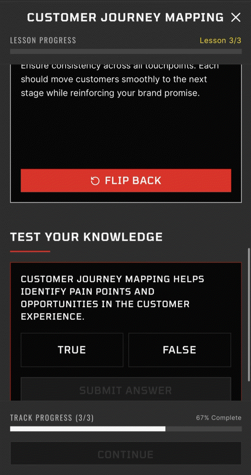
- Multiple assessment types — multiple choice, flip card review, and accordion-style content, with the groundwork for the recording format as a future layer
- Track completion animation — a small celebration moment when a rep finishes a full track, consistent with the gamification thinking running through the rest of the app